Back in May, a few days after I learned I would not be able to participate in this year's Ride the Rockies, I snapped the coolest shots of a backlit butterfly in my garden.
One turned out so cool, I decided it needed to be a greeting card.

When I first joined Greeting Card Universe, I was designing cards every chance I got. I never made a fortune; I make an average of 14 cents per card sold. Yet I made enough money from sales to pay for all four of my websites. That meant I didn't have to pay for them out of my pocket. That was good enough for me.
I also took great pride in the fact I had designed cards people found meaningful, particularly in the patriotic and cancer categories.

About four or five years ago, GCU notified all its artists the company had revised its image guidelines and warned that reviewers would be systematically rejecting cards that didn't meet the new rules. Artists were encouraged to go through their own collections and weed out images that did not meet the new standards.
I had experienced a pretty dramatic change in my internet access and did not have time to review my 945 cards, especially since everything on the GCU site takes so darned long to upload. I expected to lose about a quarter of my existing greeting cards, and I trusted reviewers to make logical rejections.
About eight cards were rejected in the next year, and that was all. I was pleasantly surprised, and a number of my cards went on to become heavy sellers. I assumed the rest of my cards had been deemed okay, and life went on busy and fairly internetless for the next few years. Once in a while, I'd design a new card or a new series of cards, and I'd go hang out at the bookstore or the grocery store to upload my card images via free wifi. (Because all that was available at home was lousy, unreliable and limited dial-up that crashed at least every ten minutes.)

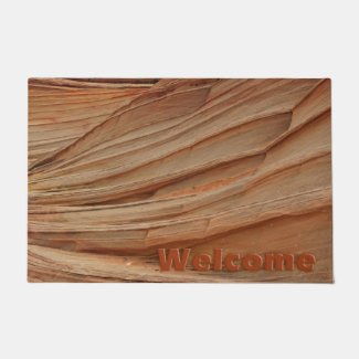
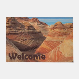
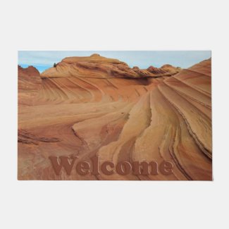
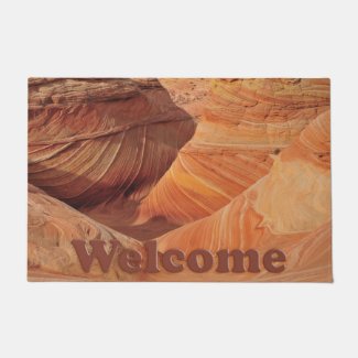
We got drawn for The Wave, and I designed a few more cards to commemorate the occasion. Several of my new cards were rejected or placed on hold because my prized images didn't "meet the new guidelines."

What the heck?!?
I spent an evening looking up the associated guidelines. One of the on-hold cards came with a non-standard form reviewer request to remove "Vermilion Cliffs" from the keywords because, as the reviewer said, "the keywords do not serve as a reference to the image."
What the heck?!?
I replied to the reviewer, stating that, in fact, Coyote Buttes is indeed inside the Paria Canyon-Vermilion Cliffs Wilderness. I never received a reply, and the affected greeting card was never approved.
I candidly confess I did not spend much time on GCU after that. I continued to rack up sales, and I designed and ordered cards from my private gallery nearly every month for at least the next three years instead of going through the lengthy rejection process... I mean, the lengthy review process.
My butterfly card was the first image I thought was exceptional enough to become a greeting card since that time. I uploaded it to both the approval queue and my private gallery. I ordered a few of the new cards from my private gallery to send out that month, and I expected an approval in the next three weeks or so. Just in time for summer card-sending!

Instead, I received a rejection notice stating the lighting was not acceptable under the new guidelines.
What the heck?!?
The lighting was what made the image, in my opinion! Plus, the cards I'd sent out had been loved and appreciated by recipients.
What's worse, my butterfly cards apparently opened the floodgates of a gigantic can of worms. For the next four days, I received approximately 40 to 50 email rejections per day for existing cards.
Just when I was trying to pull myself up out of the depths of depression, I got kicked in the creative gut so hard, I wasn't sure I'd ever be able to stand up again, creatively speaking. This choice experience also happened when I was deliberately staying away from the computer due to what I thought was mouse elbow (using the computer mouse so much, the equivalent of tennis elbow sets in). I wasn't exactly in the best spirits to be able to respond to, much less process, so much rejection and negativity in such a short time frame.
(One of the reviewer notes that accompanied a number of the rejections in standard cut-and-paste fashion was the thought-provoking, "No more hand-holding! Read the Guidelines! There's no reason for an image such as this to be submitted!")

The reviewers took the weekend off, and I thought we were done. THANK GOODNESS!!! I thought I'd been through the worst. The following Monday, the rejection notices started overflowing my already neglected email again, but at a slower pace. Probably because I didn't have many cards left to reject!

The next time I had about an hour to spend online, instead of catching up on things I needed to do and probably should have been doing, I sifted through a few of the rejection notices.
All my tiny crocheted bear images had been rejected because "most stuffed animals are copyrighted and are not allowable in for-profit commercial images." For those who don't know, I make my bears (and all my little critters) with no pattern. I hold the copyright.

To my horror, five of my most popular cards, two of which have been on the GCU best-seller page for years, had been rejected. One suffers from "lettering effects." It seems some of the effects I like to use are no longer in style, according to GCU.
And I quote: "Beveled Text: Now there’s an effect that is long past it’s expiration date. Excessive beveling of text went out in the late 90s/early 2000s and though there are still some uses for a slight beveling of your text, they are rare. Today’s typography trends are much more minimalistic with simple, uniform edges which have no effects whatsoever, with the occasional subtle shadow or outline."
Um, use of apostrophes for the word "its" is something that could use a little bit of research on your part.
So, humor aside, my top-selling Mother's Day greeting card is no longer appropriate because of beveled edges and shadowing beneath the text. Whatever.

The biggie, though, was the rejection of my two different shots of the flags from the Healing Fields in Northglenn. In 2003, the Colonial Flag Foundation erected more than 2,000 flags in a park across the street from Webster Lake, named after a Northglenn police officer killed in the line of duty, to honor those who lost their lives on September 11, 2001.

Don't you just love targeted ads???
I had let the card images speak for themselves on the outside, and on the inside, the (standard, no effects) text read, "Freedom is not free," "Home of the Brave," "Let Freedom Ring" or "Freedom is Not Negotiable." The first one had sold more than 2,000 copies and was GCU's biggest seller for two years straight. I received notice of a sale of from 50 to 200 of one of these cards on each of the patriotic holidays... Memorial Day, Fourth of July, Patriot Day and Veterans Day.
Now, all four cards had been summarily rejected because the "image doesn't meet the new guidelines". No specific guidelines are referenced for either image. I studied the guidelines. Effects, resolution, lighting, noise and poor quality scans do not apply. In my mind, there is absolutely nothing wrong with either of these photos. I realize image appeal is subjective, dependent upon the viewer, but my flag images are perfectly exposed, well-cropped and perfectly suitable for the messages they contained.

I searched the GCU forum and found the initial 2012 post warning that rejections were forthcoming. It stated that reviewers have no access to sales statistics and advised artists to contact the moderator if a card with high sales was rejected.
So I did.
That was back in July. I also asked that rejection notices be sent combined in ONE email as opposed to 200 a day because artists can be somewhat moody, and why risk sending someone who is making money for the company off the deep end? I've had no response whatsoever.

I realize the greeting card market has tanked. I've seen card shops closing everywhere. People tend to send their greetings for free via social media these days. I realize it's expensive to house millions of electronic images in an effort to sell paper cards when paper cards just aren't the big thing anymore.
GCU has the right to do whatever they want with their space. It cost me nothing to open a shop on the site. It was a worthwhile endeavor for a good, long time.
It may be time for me to move on. It may even be time for me to focus more on the handmade cards I've been making for the last couple of years.

The thing I liked best about GCU is that you can send a card to a recipient directly from the website, without having to wait for the card to arrive in the mail so you can sign it and mail it again. There's a handy handwriting font online, and you can even choose ink color.
It's going to be an adjustment for me to start ordering cards more than a week in advance of the date they need to be mailed again if I break free from GCU, but it's something I must consider because, quite frankly, I don't know that I want my artwork to be profiting a company that operates the way GCU is now operating. Besides, my sales have dropped to next to nothing, and my official gallery is down to 45 approved cards now.
I've placed my biggest sellers in my private gallery, which doesn't benefit from website searches and isn't listed when someone does a general internet search such as "patriotic greeting card."
In the past, I've ordered greeting cards from Zazzle and SmugMug, and I've also printed Christmas cards for my own use at Walgreen's and Target. SmugMug has the best quality, of course, but it's pricey. Zazzle and department/drug stores have good quality, but you can't pay the merchants to mail the cards for you.
Spoiled, huh?

I hope to eventually have my greeting card designs moved to another site, but for now, 60 of my best sellers and favorites are in my private gallery at GCU. Eventually I might get the time to build my own little sidebar link here on my blog, and perhaps that can help attract search engines.
I require additional online time to accomplish that, and it's not a priority right now, even though my arm is healing up well.
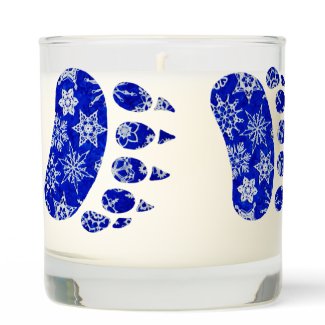
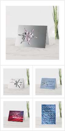
Until then, enjoy yet another of my rejects right here, on my blog!










Wow, they sound like they really have a stick up their bum. If people like the cards and they are sellers and they are making the company money, you'd think they wouldn't care. Reviewers be damned. Best to ignore the internet trolls anyway. Don't feed them and carry on.
ReplyDeleteThanks, Pat. Indeed, I do plan to carry on, carry on. Never give up!
DeleteWow wow wow - The power of anonymity eh? I think those are beautiful cards - and the images are so powerful -especially your flags!!
ReplyDeleteI think that's the key in this situation, Alycia. If they had to talk to me in person, I wonder if they would be as condemning and sometimes rude...
DeleteIt's like dealing with a giant machine ... one that can't spell correctly or think logically.
ReplyDeleteI just heard yesterday of a site called Red Bubble - might be worth checking them out.
Don't give up! Your images are too beautiful not to share. It sounds like this might not be a good company to be associated with anyway.
I've used Red Bubble once, Sue, but I'd forgotten about them. I may take another look. Thanks for the shot of enthusiasm! I definitely needed that!
Delete